Role
UX/UI designer
Context
I moved to London 🇬🇧 for a UX course at General Assembly. Setting up my new flat meant a weekend of "IKEA instructions & chill". The instructions revealed real usability problems, which sparked my GA final project.
00.-
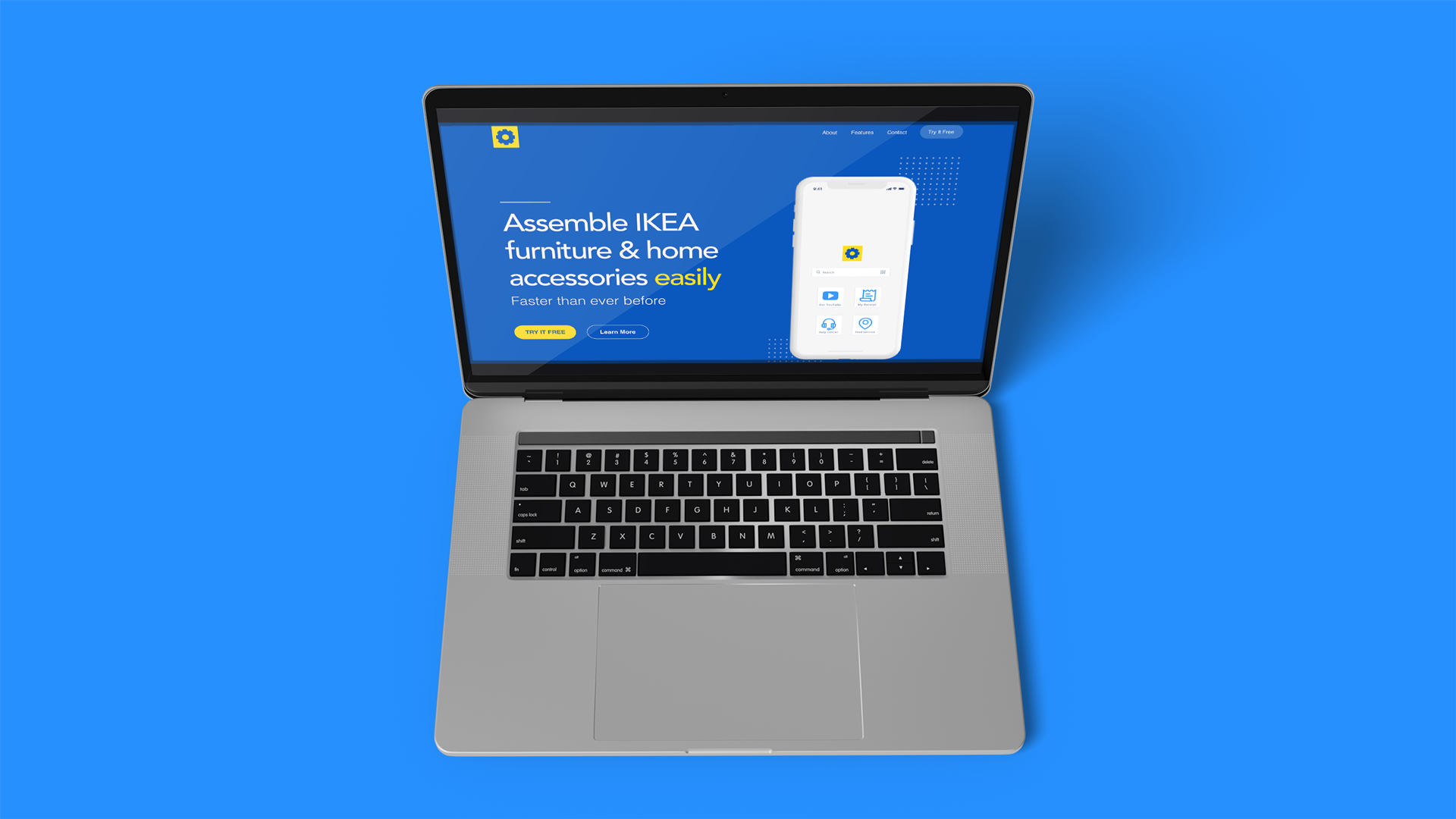
Project Start
Project steps
GA projects ran on a simple rhythm: do research and design in class and at home, capture findings in a weekly submission, get mentor feedback, discuss progress in stand-ups 💬, iterate.
We framed the work with the Double Diamond 💎: Discover, Define, Develop, Deliver. The real process loops, but I show it linearly here for clarity.
01.-
Discover
Assembly is where frustration starts
01.-
Discover
Problem statement
Assembling IKEA furniture often turns into guesswork. The booklets are minimalist and monochrome, steps can feel ambiguous, and small details are easy to miss. Most people build on their own and are not willing to pay extra for assembly, so the instructions need to be clearer and kinder.
Background:
1. IKEA keeps prices low with ready-to-assemble products.
2. To save on printing and stay on brand, instructions rely on icons and black-and-white pages.
3. It's fast to produce, but hard to read at home, especially for first-time builders.
02.-
Discover/Define
What people said
02.-
Discover/Define
📝 Research plan & interview notes
This was my first round of in-person interviews, so I was a little nervous. I kept one GA rule in mind: create a safe space and listen. My job was to ask open questions, follow up with "why," and give people time to think.
I learned that interviewing works when you bring empathy and curiosity. Several people said they had already turned to YouTube for help with IKEA builds, which hinted that the written booklets were not doing enough.
Research Questions:
1. How do people assemble 🛋 IKEA furniture and home accessories at home?
2. Where do they get stuck and how often?
3. What makes the instructions hard to use?
4. How do they solve problems now, for example YouTube, friends, or paid help?
02.-
Discover/Define
🔍 Affinity mapping & findings
After the interviews, I grouped notes to spot themes.
Key findings:
1. People choose IKEA for 💰price and simple Scandinavian style;
2. Many move 🚚 often, so flat-pack and easy transport matter;
3. Most won't pay for 🛋 assembly and try to build on their own;
4. Instructions feel unclear: no text, tiny details, ambiguous steps;
5. People already look for help on YouTube.
02.-
Discover/Define
How usable are IKEA instructions?
02.-
Discover/Define
⚙️ Contextual inquiry
This part wasn't required at GA, but I wanted real behaviour, not just lab talk. So I ran two contextual inquiries to watch people assemble at home. It was London in winter 🌧, which made it the perfect indoor study.
I recruited outside GA to avoid bias. My first participant was a guy from my local gym; I didn't use classmates because designers tend to overperform and "game" the task.
I chose the IKEA HOLMÖ lamp as the test item: portable, inexpensive, and representative of IKEA's instruction style. Carrying a table across London didn't feel like a good idea 😸
02.-
Discover/Define
🔩️ Contextual inquiry #1
I ran the first session at my local gym. A trainer volunteered; he was a bit unsure at first, but joined after I explained the study. Before starting, he looked at the assembled HOLMÖ lamp on IKEA's site for about 10 minutes to see the goal. He then built it using only the printed IKEA instruction booklet.
Outcome:
1. Assembly time: 11 minutes
2. Mood: frustrated
3. Biggest hurdle: starting the build and matching real parts to the drawings
02.-
Discover/Define
🔩 Contextual inquiry #2
My own first build took about the same time as the trainer's and the similar-looking parts confused me too. For the second session, I numbered the parts with small stickers to see if that would help.
I recruited a GA front-desk staff member. She had the paper instruction only and no photo of the finished lamp. The numbered parts followed the order of the booklet.
Outcome:
1. Assembly time: 4:30 minutes (from 11 minutes)
2. Mood: calm / happy
3. Effect: numbering made it easier to match parts to drawings and start confidently
03.-
Discover
What exists today?
03.-
Discover
📝 Analysis
Finding true competitors was tricky. I couldn't find retailer-made, user-friendly assembly instructions or an official app for furniture retailers. Most help comes from YouTube creators, helpful but patchy and hard to search at the moment you need it.
At the higher end, brands also rely on basic booklets, but their customers often pay for assembly, so clarity pressure is lower.
From what I saw, colour and clearer step visuals make instructions easier to follow. Printing in colour would push costs up for IKEA 💸, so the practical path is digital where richer visuals, short clips, and small hints can live without raising the price of the product.
BILT is a useful reference for interactive instructions, though it doesn't include IKEA.
04.-
Define
Who are we designing for?
04.-
Define
Personas, storytelling and storyboarding
Before feature prioritisation and lo-fi prototypes, I defined the users. I created two personas and a simple story arc for the "buy → assemble" journey. I printed them and kept them on my desk as a constant reminder of who I was designing for.
Those printouts helped when decisions got fuzzy. Looking back at the personas reset my focus on real goals, tasks and constraints, not my own wishes for the app.
04.-
Define
📱 User happy path and flow-map
I started with a simple happy path and iterated the flow ~20 times as new research came in. After card-sorting and whiteboarding, the flow expanded to cover entry points, errors, and help moments. The final map reflects how people actually assemble, not how I hoped they would.
05.-
Define
Which features matter most?
05.-
Define
🗂 Card sorting
📍To prioritise features, I ran two rounds of card sorting. Round 1 explored core needs; Round 2 validated edge cases and "nice-to-haves".
1. 🔧 Tools list and parts list
2. ⏸ Play/pause and variable playback speed for videos
3. Open the brand's YouTube channel for longer help
4. ⬇️ Download for offline use
5. 🔇 Sound on/off toggle
6. 💬 Live chat support
Insight: ~60% said they'd like to share their result when they finish. That led me to test "social/timer" ideas in Round 2.
📍Round 2 — Clarifications & nice-to-haves.
1. Voice-over guidance on videos
2. Switch to the paper/manual mode if preferred
3. Zoom on a paused step to inspect details
4. "How many people needed?" indicator for big items
5. Optional share to social after completion
So what? (MVP focus)
Ship the video-first flow with tools/parts lists, essential video controls, offline, and a simple sound toggle. Keep voice-over, paper mode, zoom, headcount, and social share as the next slice once the core works.
05.-
Define
🖍 From features to flows (whiteboarding)
Why?
After two rounds of card sorting I had a long, unstructured feature list. Before moving into low-fidelity screens, I needed to group features, spot gaps and agree the navigation model.
What I did?
I ran a focused one-day whiteboarding session, mapping tasks, states and dependencies. I started with the happy path, then layered edge cases and entry points (QR → camera → app, paper / video toggle, support).
Outcomes:
1. Consolidated MVP features (tools list, parts list, video controls, offline mode, support);
2. Defined navigation: bottom-nav items + on-screen controls for the assembly flow;
3. Clarified mode switching: paper ↔︎ video at any time; zoom on paused frames;
4. Produced a full user flow that unblocked lo-fi prototyping.
07.-
Develop
Lo-fi prototype & early feedback
07.-
Develop
Digital key screens
I translated the whiteboard flows into quick digital sketches to explore layout, navigation and key interactions.
Why sketches (not hi-fi)? They're fast to iterate, easy to annotate in Figma and keep the focus on task clarity rather than visuals.
✏️ What I explored:
1. Entry paths: scan the QR on the box → deep-link to the right instruction;
2. Account friction: optional sign-in; start assembly first, save later;
3. Media controls: play/pause, speed, sound on/off and a zoom-on-pause pattern for details;
4. Mode switching: toggle between video and paper-style steps mid-assembly;
5. Assistance: quick access to tools list, parts list and live support.
✏️ How I captured feedback:
1. Each key screen in Figma has a tappable hotspot that opens a short note (e.g., "tap a tool icon to see an overlay with name + usage");
2. Overlays dismiss with a single tap anywhere—kept deliberately simple for gloved/greasy hands.
07.-
Develop
📱 Wireframes
I stayed in lo-fi to move fast: design → test → tweak → repeat, instead of jumping straight to hi-fi. Keeping everything in greyscale helped people focus on the flow and content rather than the visuals.
I created around 70 core screens and stitched them into an interactive lo-fi prototype that covers the full assembly journey, support, and receipts.
08.-
Develop
Hi-fi prototype
08.-
Develop
Prototype
I built a small UI system (colours, type, components) and applied it to the wireframes in Figma so everything stayed consistent.
I then created an interactive hi-fi prototype. It was originally hosted on InVision (now retired), so I documented the key flows as screens below.
User testing (3 in-person sessions)
1. Scenario: participants scanned a QR code on the box, opened the matching instructions and started assembly.
2. What worked: optional sign-in, search and receipt saving were understood without explanation.
3. Improvements: larger tap targets on controls, clearer progress indicator and softer error states on forms.
Finish.-
Mentor feedback — General Assembly